CANON SNAPSHOT
THE BIG QUESTIONS
How do we help photography professionals and enthusiast to easily find the articles that is most useful and interesting to them?
Can we add more personalization to how they experience the Snapshot website?
How can we showcase the robust content and the wealth of useful articles that can be found in Snapshot?

THE DETAILS
Snapshot is a content portal produced and managed by Canon, with user base comprising mostly of professional photographers and photography enthusiasts.
They called for a pitch presentation among agencies in the 3rd quarter of 2015.
At that time, the website is in bad need of a re-design. The user experience is disjointed and finding content is counter-intuitive. It also needs an over-all restructuring of content architecture. The whole back-end system is also up for a whole revamp to enable better CMS and there’s a strong need to rebuild a robust backend development framework.
THE BUILD
We presented our web-revamp plan and the project was awarded to our D+T Team at Havas Media. We are happy to get this project but we also know that we need to get down to the nitty-gritty details and there’s a lot of work to do.
I have worked closely with our tech team and together, we planned the content architecture of the whole website. Each content buckets must be seamlessly integrated into the whole front-end and back-end structure. As a CMS-driven website, different type of admin users can have the authority to publish and edit articles. Tagging and categorization of articles have been enhanced to fully realize the power of search function within the site.

THE PROCESS
I have worked closely with our designer in mapping the user journey and created journey-based scenarios. Low fidelity wireframes and quick prototyping tools such as InVision had greatly accelerated our work process. Client-side project owners can access our InVision link and comments are easily exchanged between the two parties. This process eliminated friction between the D+T Team and the client. This healthy relationship is what made it possible for us to create an excellent platform.
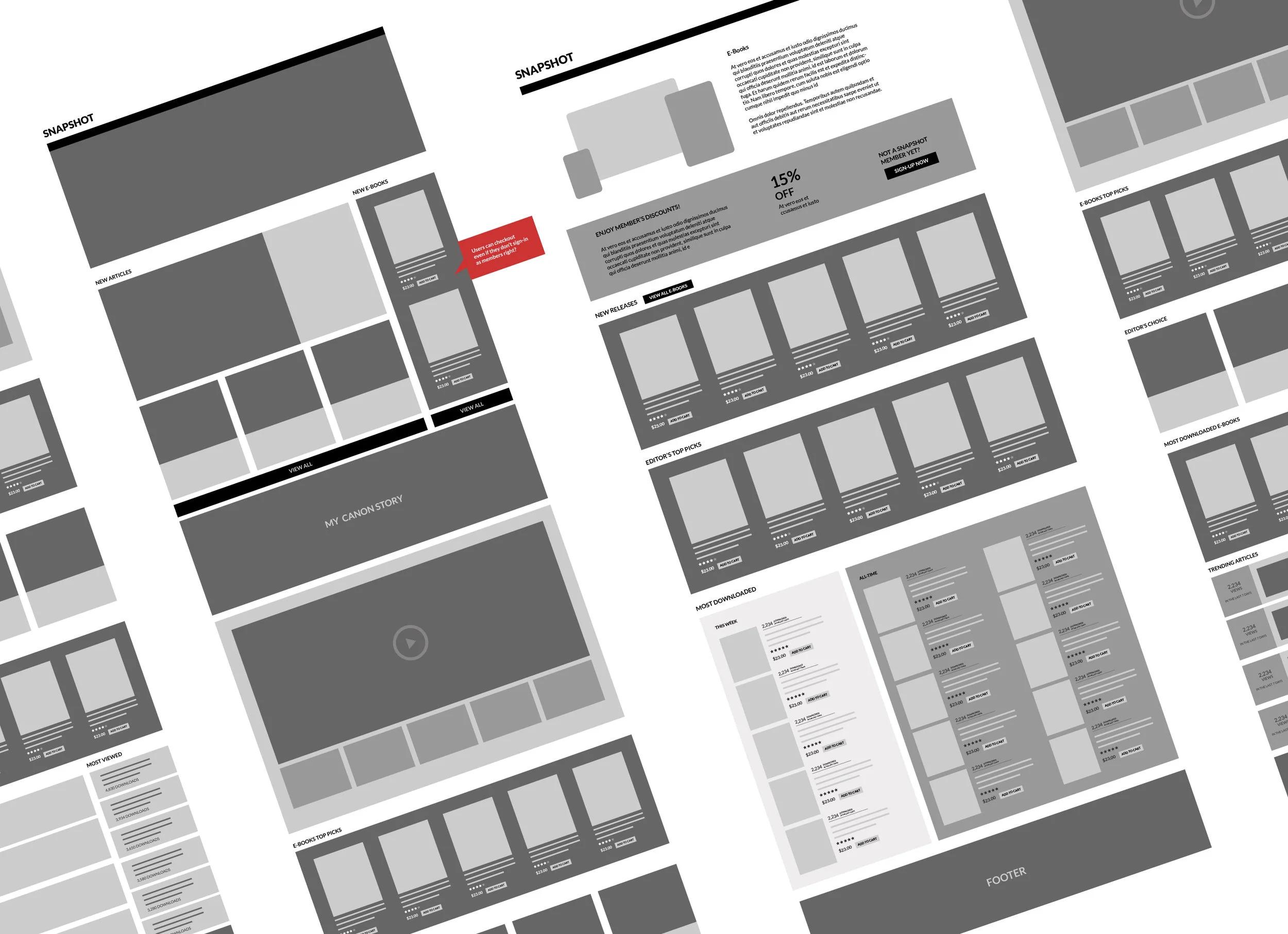
We proceeded to the actual user interface design once the high-level user journey had been approved. Snapshot is all about photography and our design language focused on big, vibrant images that directly communicate to its audience.
Content cards showing big thumbnail image serves as windows to exciting content inside. The title complements the image and encourages click-through.
As we go along the actual UI design, we have given extra room for enhancement in terms of user experience. It is common for some gaps to appear during the UI design stage that we have missed during the design of the user journey and wireframing phase.

RESPONSIVE SCREENS FOR MOBILE VIEW
FUNCTION HIGHLIGHTS
Here’s a list of the highlights of the web revamp:
1. We have created a user-login function where users can sign-up for free and edit their preferences. They can opt to receive edm on articles related to their pre-selected preferences. Users can also save articles for later reading.
2. Robust search function
3. Intuitive user experience with sleek, modern UI design
4. Fully-responsive website with devise-specific adaptive layout
5. Content upload was rolled-out in full CMS
6. Multi-language selector
7. Highly optimized website with faster loading time
PHASES
The first phase was rolled-out at the end of January 2016. This is the time when we have started studying and monitoring the user behaviors. Where do they click, what are the articles that are more popular, what language group have the highest number of users, etc.

THE UI DESIGN OF THE FIRST PHASE ROLLOUT
Based from these data, we have proceeded to enhance the homepage and added new features such as trending articles, most-viewed articles and videos. Snapshot has also added and launched the Photographer’s Blog series.

THE UI DESIGN OF THE SECOND PHASE ROLLOUT
RESULT
For the first 8-months pre revamp, SNAPSHOT had a user base of 261k+, 695k+ page views and a bounce rate of 69.97%. 8-months in, post revamp, the user base is 1m+ contributing to over 2m page views with a bounce rate on average of 39.67%.
MOVING FORWARD
We are doing continuous research on our user behaviours and we want to make sure that the website’s design direction stays relevant and updated. As with all things related to the internet, we don’t rest on our laurels and always work to push the boundaries of Canon Snapshot.